


 2019-05-26
in
2019-05-26
in

 5 min read
Getting started with a new library, framework, or development system requires two important things: documentation and code samples. With both of those a developer has enough to start fiddling with things and get bootstrapped. Code samples without documentation can be like searching a dark room without a light but is doable Documentation without samples can be far more difficult than that. In fact for more complicated APIs it can be impossible without source code, which I guess is sort of code samples in and of themselves. For a lot of projects the code samples I go to are the unit/automated tests. What better place to see how the library is used than in there. However having actual code samples, especially for more complicated libraries, is even better. In the case of Avalonia the project has shipped a “controls catalog” as part of their mainline source for a while now. However now you don’t have to pull down and build the full Avalonia source code to get it since there is a stand alone version of it. Here’s how to use it with Rider and AvalonStudio .
NOTE: This article is from 2019 and Avalonia has been under active development and improvement since that time. Please consult newer tutorials and documentation for how to use this against current releases of Avalonia.
The simplest means of getting started with this is to just download it and run it from the command line. The ControlCatalogStandalone GitHub Project is all you need now. To quickly bootstrap it we can execute the following commands on a machine with .NET Core 2.1 or higher installed:
git clone https://github.com/AvaloniaUI/ControlCatalogStandalone.git
cd ControlCatalogStandalone/
dotnet restore
cd ControlCatalog.NetCore/
dotnet run
Which brings up the application that looks like this:
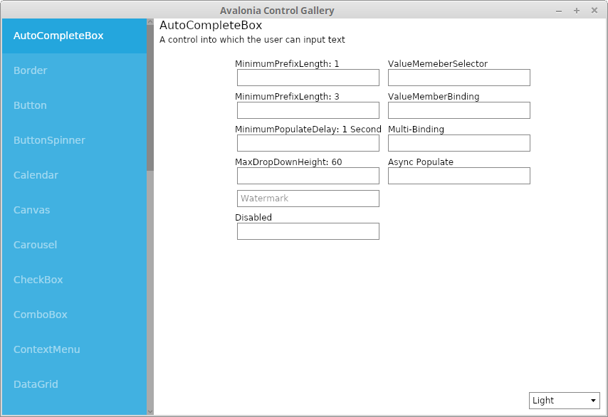
Avalonia Catalog Stand Alone App after quick build/run sequence
What essentially you have is a vertical tab of all of the control types that Avalonia supports right now. That’s something as simple as buttons to as complex as data grids or calendar pickers. If you click on any one of the tabs it’ll take you to wired up examples of each. Want to know how style a button? Go to the Button tab. Want to know how to implement a date range calendar selection on a Calendar control? Go to the Calendar tab. There are even some tabs for complex actions like drag and drop between controls(drag+drop tab) or dynamic editing of layouts (LayoutTransformControl tab) within Avalonia. It doesn’t have everything but it is quite the array of examples. So with that how do you find what you are looking for?
First, there is a .NET SLN file so you can load it right up in Visual Studio, Rider, or AvalonStudio. The structure of the folder is pretty simple:
ControlCatalogStandalone/
├── ControlCatalog
├── ControlCatalog.NetCore
├── ControlCatalogStandalone.sln
└── NuGet.Config
The solution and the NuGet file are the usual .NET files. The ControlCatalog folder is where all of the actual code you will be looking for is located. The ControlCatalog.NetCore is the program that you launch when you are running the application. Inside of Rider the solution structure looks like:
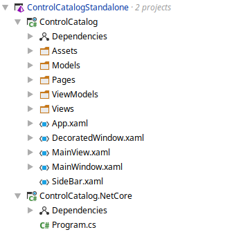
Control Catalog Folder Structure
The “Pages” area of the ControlCatalog project corresponds one for one with the tabs in the UI. So for example if you went to the above mentioned Button page and want to see the corresponding code just go to ButtonPage.xaml and/or ButtonPage.xaml.cs and look at the corresponding code. In Rider it’ll look like this:
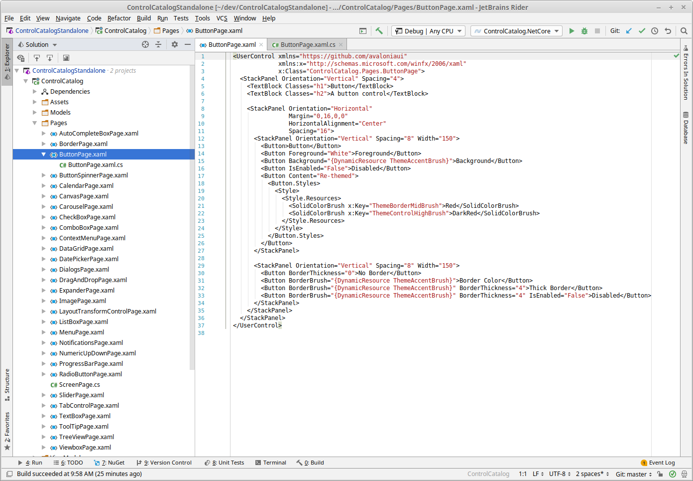
The Button Page in JetBrains Rider IDE
If you are using AvalonStudio you’ll be able to not only see the XAML and code but also a rendering of the “page” control as well:
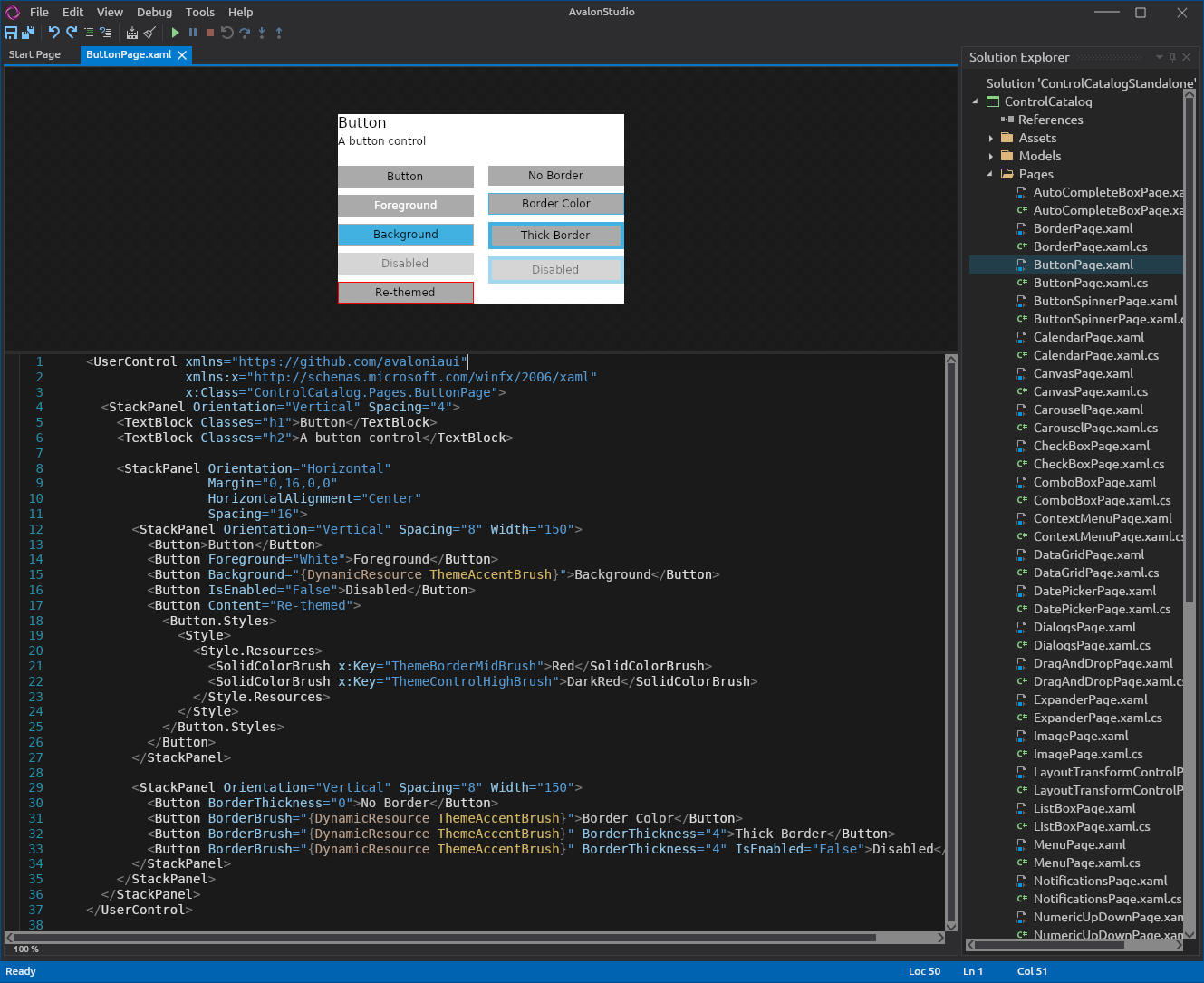
The Button Page in Avalon Studio Beta
Two things to be aware of with doing this in AvalonStudio (remember this is beta software under active development at the time of this writing). First, once you load the solution you’ll need to set the default project to the ControlCatalog.NetCore project. It will be fixed in a later version but in v0.6.2 not having a default project selected causes AvalonStudio to crash. Second, the rendering can be a bit on the slow side right now so give it a few seconds to parse and render the controls. Third, most of the examples work fine out of the box but some do not. Particularly:
- DataGridPage doesn’t render and makes AvalonStudio unstable and crash. Do not load this one right now.
- CarouselPage doesn’t render
- ImagePage doesn’t render
- MenuPage doesn’t render
- TabControlPage doesn’t render
Overall this provides a really solid set of examples of how to work with the controls however it is still just examples. The primary purpose of the project is to showcase the controls and give you some idea how to use them. It’s not there to teach you the best way to implement them from an MVVM design pattern perspective or that sort of thing. In many places they can and do but that shouldn’t be a first assumption. As I’m learning part of my process of indoctrinating myself in MVVM after years of MVC there is a lot of “it depends” on that front too that has to be taken into account.
For each of the controls of interest this catalog application provides a good starting part for figuring out how to start working with these controls, especially in conjuction the API documentation and the Main Documentation . As I continue to explore I’m hoping to write more blog entries about some of the details of implementation and help include that potentially (if desired by the project) in their documentation as well.