


 2019-06-09
in
2019-06-09
in

 6 min read
In Avalonia Buttons Multiple Ways I went through a tour of the various ways one can bind buttons to commands and events. I wanted to explore the topic just a little deeper and look at some of the more advanced scenarios of dealing with binding behavior, specifically passing parameters to commands and setting the button’s enabled status based on other data in the View and View Model. Let’s build a little app to show how to do this, but you can find the final solution for this blog post in this Gitlab Repository .:
NOTE: This article is from 2019 and Avalonia has been under active development and improvement since that time. Please consult newer tutorials and documentation for how to use this against current releases of Avalonia.
For this application example we are going to want the following behaviors: * The application is supposed to generate a simple “Hello World” style greeting when a button is pushed. * One button will use a user editable “Name field” for the greeting. That button is only available if a name is typed however * One button will generate a generic greeting * A checkbox will allow the user to enable/disable whether a generic greeting can be generated
The application when completed will look like the following:
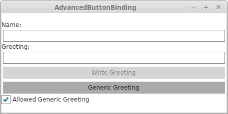
Application showing binding button state to other data and passing parameters to bound commands
The XAML for the above View is as follows:
|
|
…and the corresponding View Model is:
|
|
Let’s look at these pieces in isolation.
Toggling Button State Dynamically
There are many instances where we don’t want a button to be active unless certain preconditions are met. A button can be enabled and disabled via the IsEnabled property. Let’s look at setting that up with a binding to the CheckBox’s state (see the Avalonia Documentation on Bindings to Controls
for more details). You can see on line 42 of the XAML that the “Generic Greeting” button’s IsEnabled property is set to {Binding #AllowedGreeting.IsChecked}. The CheckBox’s name is “AllowedGreeting” and it has a property called IsChecked that we want to have connected. In Avalonia the hashtag tells the Binding code to look for a control by that name when attempting to do the binding. This simple setting therefore makes it so that the “Generic” button’s state is synchronized with the checkbox
Passing Parameters
Many of the commands we see take no arguments but that’s not always the case. For times where you need that there is an property called CommandParameter which can be used for passing data to the command itself. Let’s look at the generic button first:
<Button Grid.Row="5"
        Content="Generic Greeting"
        Command="{Binding WriteGreeting}"
        CommandParameter="User"
        IsEnabled="{Binding #AllowedGreeting.IsChecked}" />
As we can see we are binding this button to the WriteGreeting method on the View Model.
public void WriteGreeting(string personsName)
{
    Greeting = $"Hello {personsName}!";
}
So this method is expecting a string argument for the name it’s going to write. In the case of the Generic name we are just going to put in a generic User string which is why the CommandParameter field is set to that in the definition above. However just like everything else it too can be bound to a dynamic data source. Like we did with the regular “Write Greeting” button:
<Button Grid.Row="4"
        Content="Write Greeting"
        Command="{Binding WriteGreetingReactiveCommand}"
        CommandParameter="{Binding Name}" />
Here the CommandParemeter is bound to the Name property on the View Model instead. Recall further up that the TextBox where we enter a name is also bound to the same Name property. So when the button is activated the Name field is read and passed into the calling function. However we want to have that button be disabled unless there is a name there. We could potentially do that all the same way we did the checkbox but the ReactiveCommand will do that for us
Reactive Command Button State Validation
As stated above we have a requirement for having a disabled greeting button unless there is a name there. We can pass a validator to the ReactiveCommand which will automatically toggle the button state for us based on whether the validation comes back true or false. The button binds to the ReactiveCommand WriteGreetingReactiveCommand which is configured for this behavior. Let’s look at that code more carefully:
|
|
As we did in our first example we defined a new ReactiveCommand property so the View can bind to it in the last line above. We then define the property in the constructor (lines 6 through 8), again similar to what we saw in the previous tutorial. However there are some differences. First, our lambda function takes an argument name which is then used within the function itself. Second, there is an additional buttonEnabled argument. This argument needs to be an IObservable<bool> which says whether the command can execute or not. Essentially if the command can’t execute then the button will switch into a disabled state. Using ReactiveUI WhenAnyValue method on our class we can perform this check (see the ReactiveUI documentation for more examples
) (lines 3 through 5). Lastly we had to specify the type of the argument into the function, in this case name which is a string. With that all configured it’s ready to go and the application is complete.