


 2019-06-13
in
2019-06-13
in

 8 min read
A common way for displaying and manipulating tabular data is some sort of spreadsheet like area which is often called a data grid. In Avalonia that control is literally DataGrid
. Starting with a standard project it’s relatively easy to get started however there are a couple of important steps that can be easy to overlook. We are going to go through starting from the default template all the way through to having an application that allows one to edit a data grid. You can find the final solution for this blog post in this Gitlab Repository
.
NOTE This article is from 2019 and the DatGrid implementation has changed quite a lot in recent versions. This therefore does not work against recent versions of Avalonia. Please consult newer tutorials and documentation for how to use this against current releases of Avalonia.
Getting Started
Starting from a standard template project there are a few manual steps that are needed to get a DataGrid working which we highlight below. They are:
* Update from 0.8.0 to 0.8.1
* Update Program.cs to bring in a new import needed by 0.8.1 that wasn’t needed in 0.8.0
* Update the App.xaml styles list to include the DataGrid’s style
First, create a new project using the steps in Getting Started :
dotnet new avalonia.mvvm -o DataGridExample -n DataGridExample
cd DataGridExample
dotnet new sln
dotnet sln add DataGridExample.csproj
Next let’s prepare our project for being able to use the DataGrid. We need to update our package references so that we are pulling the latest version of 0.8.1 which has the DataGrid. Note that the default 0.8.0 (which is the latest release build) of Avalonia as of the date of this writing (13 June 2019) will not work for our purposes. Open the C# Project file and let’s change our dependencies. We are going to update the version numbers to the latest 0.8.1 and then also add an additional dependency for the DataGrid. At the time of writing my DataGridExample.csproj file as generated from the template has a references section that looks like:
<ItemGroup>
    <PackageReference Include="Avalonia" Version="0.8.0" />
    <PackageReference Include="Avalonia.Desktop" Version="0.8.0" />
    <PackageReference Include="Avalonia.ReactiveUI" Version="0.8.0" />
</ItemGroup>
when we’ve added the additional lines and bumped up version numbers it should read:
<ItemGroup>
    <PackageReference Include="Avalonia" Version="0.8.1-cibuild0002889-beta" />
    <PackageReference Include="Avalonia.Desktop" Version="0.8.1-cibuild0002889-beta"/>
    <PackageReference Include="Avalonia.ReactiveUI" Version="0.8.1-cibuild0002889-beta" />
    <PackageReference Include="Avalonia.Controls.DataGrid" Version="0.8.1-cibuild0002889-beta" />
</ItemGroup>
If you try to compile and run you will get a peculiar error that:
Program.cs(21,18): error CS1061: 'AppBuilder' does not contain a definition for 'UseReactiveUI' and no accessible extension method 'UseReactiveUI' accepting a first argument of type 'AppBuilder' could be found (are you missing a using directive or an assembly reference?)
The problem is that some definitions have moved around in 0.8.1 from 0.8.1. It’s a very easy fix, we just need to bring in an additional include in Program.cs. Open that file up and add the line using Avalonia.ReactiveUI; with the rest of the includes statements. So my includes at the top read like:
using System;
using Avalonia;
using Avalonia.Logging.Serilog;
using Avalonia.ReactiveUI;
using DataGridExample.ViewModels;
using DataGridExample.Views;
Now if we try to run the app using the standard command…
dotnet run --framework netcoreapp2.1
…our application now runs again and shows “Hello World” We actually have one more thing we have to do before our DataGrids will work however. The DataGrid has its own styles that we must reference in our App.xaml. Open the App.xaml file and you’ll see the Application.Styles with the standard default properties. To this we simply add the one additional style, so that in teh end our App.xaml file reads like:
<Application xmlns="https://github.com/avaloniaui"
             xmlns:x="http://schemas.microsoft.com/winfx/2006/xaml"
             xmlns:local="clr-namespace:DataGridExample"
             x:Class="DataGridExample.App">
    <Application.DataTemplates>
        <local:ViewLocator/>
    </Application.DataTemplates>

    <Application.Styles>
        <StyleInclude Source="avares://Avalonia.Themes.Default/DefaultTheme.xaml"/>
        <StyleInclude Source="avares://Avalonia.Themes.Default/Accents/BaseLight.xaml"/>
        <StyleInclude Source="avares://Avalonia.Controls.DataGrid/Themes/Default.xaml"/>
    </Application.Styles>
</Application>
We are now ready to begin writing our code.
Creating Back End Data Model
Let’s look at an application where we will be displaying a database of People for a large organization. For this we will actually be not using a backing but just mocking the whole thing up to the View Model layer only. First we will create our Person Model class under the Models folder. We will track four properties: first name, last name, an employee number, a department number, and a desk location. The corresponding code looks like:
namespace DataGridExample.Models
{
    public class Person
    {
        public int DepartmentNumber { get; set; }

        public string DeskLocation{ get; set; }

        public int EmployeeNumber { get; set; }

        public string FirstName { get; set; }

        public string LastName { get; set; }
    }
}
We will want our MainWindowViewModel to host a collection of these that we can then tie into our View. For the sake of this example we will hard code some initial people in the collection when the constructor is called as well. Like in our previous examples we will use the ObservableCollection type and auto-populate in our constructor. With the below code we are ready to start working on the actual view itself.
using System;
using System.Collections.Generic;
using System.Collections.ObjectModel;
using System.Text;
using DataGridExample.Models;

namespace DataGridExample.ViewModels
{
    public class MainWindowViewModel : ViewModelBase
    {
        public ObservableCollection<Person> People { get; }

        public MainWindowViewModel()
        {
            People = new ObservableCollection<Person>(GenerateMockPeopleTable());
        }

        private IEnumerable<Person> GenerateMockPeopleTable()
        {
            var defaultPeople = new List<Person>()
            {
                new Person()
                {
                    FirstName = "Pat",
                    LastName = "Patterson",
                    EmployeeNumber = 1010,
                    DepartmentNumber = 100,
                    DeskLocation = "B3F3R5T7"
                },
                new Person()
                {
                    FirstName = "Jean",
                    LastName = "Jones",
                    EmployeeNumber = 973,
                    DepartmentNumber = 200,
                    DeskLocation = "B1F1R2T3"
                },
                new Person()
                {
                    FirstName = "Terry",
                    LastName = "Tompson",
                    EmployeeNumber = 300,
                    DepartmentNumber = 100,
                    DeskLocation = "B3F2R10T1"
                }
            };

            return defaultPeople;
        }
    }
}
Creating a Basic DataGrid
The most basic things we need for a DataGrid is actually just the items that it will be populated bound to. We can have it auto-generate its column definitions based on that. Let’s start with that and work forward. Opening up our MainWindow.xaml file we can add a DataGrid object to a StackPanel. Below is the way it looks completed:
<Window xmlns="https://github.com/avaloniaui"
        xmlns:x="http://schemas.microsoft.com/winfx/2006/xaml"
        xmlns:vm="clr-namespace:DataGridExample.ViewModels;assembly=DataGridExample"
        xmlns:d="http://schemas.microsoft.com/expression/blend/2008"
        xmlns:mc="http://schemas.openxmlformats.org/markup-compatibility/2006"
        mc:Ignorable="d" d:DesignWidth="800" d:DesignHeight="450"
        Width="800" Height="450"
        x:Class="DataGridExample.Views.MainWindow"
        Icon="/Assets/avalonia-logo.ico"
        Title="DataGridExample">

    <Design.DataContext>
        <vm:MainWindowViewModel/>
    </Design.DataContext>

    <StackPanel>
        <DataGrid AutoGenerateColumns="True" Items="{Binding People}"/>
    </StackPanel>
</Window>
Our DataGrid only has two property. The first tells, AutoGenerateColumsn it to auto-generate the columns. By default it’s expecting us to define the columns directly, which we will do shortly. The second property, Items, is binding the table to the People property on our View Model that we created in the previous step. When this is run it will look something like this:
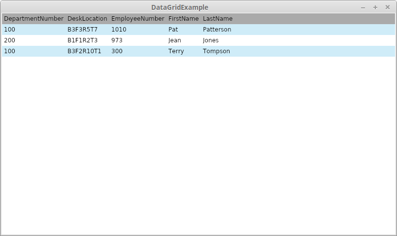
Simplest Avalonia DataGrid Example
This got us something on the screen but it obviously leaves a bit to be desired. First, the column names are simply the variable names. Second it may be that for a particular application, most applications probably, we don’t want to show every field of a data structure. We will do this by specifying the columns directly. This is done by adding DataGrid.Columns XAML to our definition and removing the auto-generation setting. Below is an example that sub-selects three of the properties and sets the columns up for that:
<DataGrid Items="{Binding People}">
    <DataGrid.Columns>
        <DataGridTextColumn Header="First Name"
                            Binding="{Binding FirstName}"
                            Width="2*" />
        <DataGridTextColumn Header="Last Name"
                            Binding="{Binding LastName}"
                            Width="2*" />
        <DataGridTextColumn Header="Department"
                            Binding="{Binding DepartmentNumber}"
                            Width="*" />
    </DataGrid.Columns>
</DataGrid>
For each of these we set the Header to be a more human friendly value. We also bound the field to the item’s corresponding property. These correspond to the properties in our Model definition. We are also defining the order we want the fields not beholden to how they are structured on our Model Class. Lastly we set up our column width. Widths can be setup the same as it could for the Grid control as specific pixel size, auto-sized, or proportional sized. For this we are setting it up as proportional sizing with the name fields getting twice as much romo as the Department Number field. For details on how these are calculated see the Grid article
on the subject.
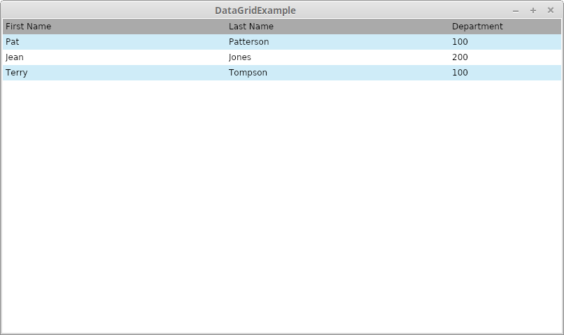
Avalonia DataGrid with explicit columns
Adding Rows and Controlling Data Editing
By default the DataGrid allows editing of data within it. Because of the data binding these edits will propagate back to the bound data sources. Just double click on any field and you can type in values. In more complex scenarios you’ll want to have data validation, propagation to backing storage like a database et cetera, but for this example it’s sufficient to know that the View Model’s data is being updated as well. A screenshot of the edit in situ is below:
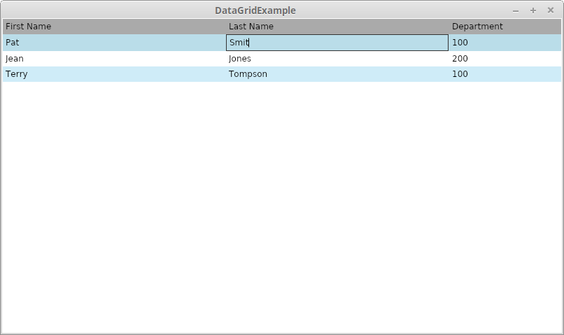
Avalonia DataGrid Editing Values
What about adding values? We will have to do a little more work to get that working. Let’s do it in the simplest way possible: adding a button which creates default settings. We will simply be adding a new Button to our View and then tie it to a new Reactive Command property in our View Model. First let’s look at the button which is added to the top of the StackPanel:
<StackPanel>
    <Button Content="Add New Person" Margin="5" Command="{Binding AddNewPerson}"/>
    <DataGrid Items="{Binding People}">
        <DataGrid.Columns>
            <DataGridTextColumn Header="First Name"
                                Binding="{Binding FirstName}"
                                Width="2*" />
            <DataGridTextColumn Header="Last Name"
                                Binding="{Binding LastName}"
                                Width="2*" />
            <DataGridTextColumn Header="Department"
                                Binding="{Binding DepartmentNumber}"
                                Width="*" />
        </DataGrid.Columns>
    </DataGrid>
</StackPanel>
We are binding to a method on View Model which should look like “AddNewPerson”. All this has to do is add a new item to the people collection, but we want to put some relevant defaults in. The code to put that together looks like:
public ReactiveCommand AddNewPerson { get; }

public MainWindowViewModel()
{
    People = new ObservableCollection<Person>(GenerateMockPeopleTable());
    AddNewPerson = ReactiveCommand.Create(() =>
    {
        People.Add(
            new Person()
            {
                FirstName = "New First Name",
                LastName = "New Last Name"
            });
    });
}
Our Command is simply leveraging the ObservableCollection’s Add method and injecting a new Person with some default properties. Once it’s put together and run you’ll see the new button which injects a row every time you click it. For example (after a few iterations):
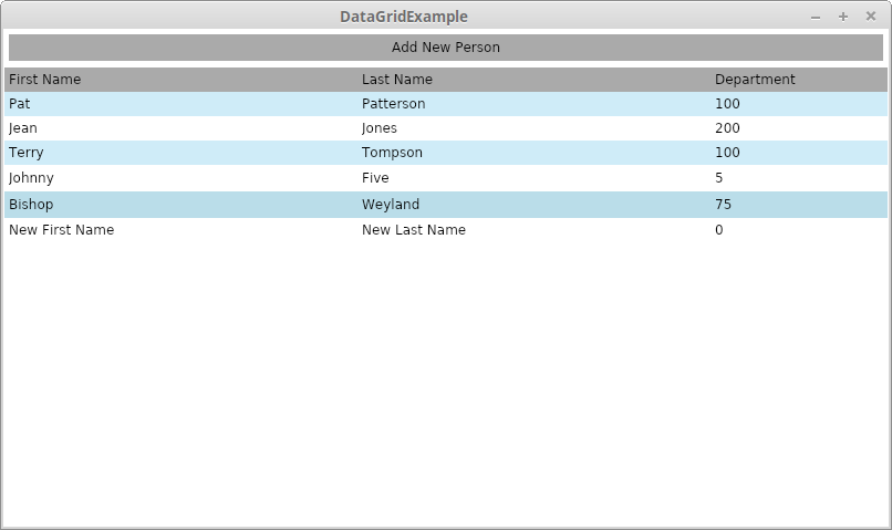
Avalonia DataGrid Getting Started Final Version
Conclusion
So at the end of this we’ve seen the basic steps need to properly setup a project to use a DataGrid. We’ve also seen how to configure and interact with it.