


 2021-06-17
in
2021-06-17
in

 15 min read
Earlier this year I was having several discussions about the actual control of development stacks. It started with people pooh poohing the .NET stuff because Microsoft has a lock on most of the contributions. It then started veering towards why people didn’t like Java because of Oracle being the big daddy on that project, and so on. The question to me then was if there was a succinct exploration of that for those projects. I found a few things but nothing that was doing it for me. Then the whole Elastic/Kibana re-licensing event happened which caused the spawn of the Amazon fork. Around that question came up discussions about how much Amazon had or had not contributed compared to how much money they were making off of it at the expense of the vendor who open sourced it. I finally decided to do an analysis of open source contributions myself. After looking around for some tools I found some that did some of the job but not entirely. That began my development of my own tools and integration of some others to create visualizations of open source project contributions so that I could make some assessment of things like stability, diversity, etc. within the confines of what information is available in their Git histories. This post is an exploration of those tools and my process.
Introduction
Open source projects have had a huge positive effect on our world. Most of the world runs at least in part on some sort of open source software. As we’ve learned from incidents like Heartbleed with OpenSSL and countless other events like that not all software we use is as stable as we think they are. Before Heartbleed the conventional wisdom was that OpenSSL was this big heavily resourced project with tons of oversight. It turned out to be the antithesis of that. Many of the software stacks we use suffer from similar problems of diversity and funding. We’ve seen burnout of the developers of heavily used libraries that we didn’t realize came down to really one person doing all of the development and support. We’ve seen cases where the development of a library wasn’t by a community but by one company and when that company decides to shift focus or abandon it the project itself. Just because a project only has one primary developer doesn’t mean one shouldn’t use it but it is good to go in with eyes open. There are lots of ways of quantifying the project contributions but the most direct way to get some indication is by looking at their source code history. That is the focus of my methodology.
Methodology Overview
All modern open source projects use some sort of version control system. The version control system is the repository where all source code changes are tracked. Modern source code systems not only track the changes in the file but also information about who changed it and why (to the extent that the author fills that data in when they commit the code to the repository). There is therefore a wealth of derived information that can be gleened from all that tracked data. This allows us to answer questions about who are the most active commiters over time, how the project changes structure and size over time, etc. Most of the modern systems have a concept of “tagging” releases. This gives us information about a release cadence and also allow us to look at the statistics on known release boundaries. From all of this we can get a lot of insight about the people and organizations that are contributing to the project. Theoretically the larger and more diverse the base of contributors the more stable a project will be. But there are limitations to this methodology that should be addressed before we deep dive into the process and some initial example results
Limitations
The first big limitation of this methodology is it only provides analysis on information that can be tracked in the source code of a project. We get line counts, file counts, contributor information, etc. only on files that are contributed to a repository. For some projects it is literally only the source code of the project and the automated tests. For some others it may include the documentation as well. However even in this expansive version it is only capturing contributions to these files themselves. Open source contribution takes many shapes. Along with making changes to the code itself there is a whole aspect of documentation which may or may not be in this repository. Documentation isn’t just for the code but code samples, tutorials, web sites etc. These are almost always tracked elsewhere if at all. Documentation at least has persistent data that could be tracked. A lot of the effort on these things comes in untrackable or sparsely trackable forms. Testing is by far the biggest untraceable contributions. Even if you have a bug tracking system it doesn’t capture the tremendous amount of hours early users or literal testers put into running software through the ringer. There is also evangelism, presentations, code reviews/audits, technical working groups for planning, and other important but untraced things. Lastly there are financial contributions to projects either directly or indirectly, through hosting services etc. It’s not just a question of what isn’t captured but also what can be misleading about the data presented.
Code contributions are not all equal in level of effort. A common fallacy in software development to this day is the “Line of Code” metric. Software is a perfect example of “more isn’t always better sometimes it’s just more.” A function that is 1000 lines long that could have been done in 30 is worse not better. Yet if we look solely at a lines of code metric between two developers it is often tempting to say that the person who submitted the 1000 line version “did more work”. What about someone who saw the 1000 lines of code, recognized that there was a more efficient and maintainable way of doing it so removed 970 lines of code. Did they do negative work? Of course not. When presented so starkly it’s completely obvious. When looked at a macroscopic scale though that can be done all the time though. There is also the fallacy that a line of code is a line of code. Reams of code may be generated with simple REST service endpoints which are cranked out in a few hours while a complicated algorithm took a man-week to finish up with only a fraction of the code generated. Some projects, but it’s only a handful, track the hours of work in a project over time. That still doesn’t capture quality but it’s another metric. None of that is in the repository though.
Lastly if the objective is to determine if there is broad community support then it’s important to correlate contributors with organizations. Like the hours tracked very few organizations keep track of this. With people’s email addresses it is possible to partially reconstruct that with data from social media sites, blogs, etc. It is a very laborious and more error prone process though. Just because someone works for a company doesn’t mean that company is supporting that contributor’s development on that project. There are ways to figure that out somewhat, which I’ll get into later.
Even with all of those limitations there is useful information to be gleaned by showing trends on the commits and data. We can also use code visualization tools like Gource to create additional insights into the code itself as well.
Detailed Methodology
Git Stat History Generator Tool Analysis Kick Off
The first step is to check out a copy of the project’s repository and run it through the Git Stat History Generator tool that I wrote. This tool combs the entire commit log of a particular branch of the project and stores data about the commit in a way that makes it easy to generate statistics later. Under normal circumstances it is best to run this on the “main” branch of the project. While it is possible to run the tool in a mode that always reviews the git history each time it runs I find it best to record a snapshot of it and store it off to an archive that can be reprocessed over and over. It is faster and for larger projects substantially reduces the size of the files necessary to transfer around. The next step is to start looking at the project contributors.
Creating Contributor-to-Organization Mappings
I think it is important to assess what the contributions look like in terms of diversity of contributors and diversity of contributing organizations. The first step in doing this is to come up with a list of unique contributors. The Git Stat tool has an analysis mode called “Unique Users” which allows us to determine across all commits on the analyzed branch who the unique contributors were by user name and email address. This gives us our first list to start from if we are trying to determine organizational contributions. With this list we can then manually cross check this with contributor information on the project website, for example the Linux kernel team maintains that, or one can laboriously build up that data through internet searches and social media look ups. From all of this one can build a look up table of usernames, email addresses, and organizations. The Git Stat tool supports a CSV and a JSON format for ingesting this data at analysis time. The question is how far to take this.
In an ideal world a project will have a master table of contributors by organization over time. Therefore one could build the lookup table with that data and have perfect information. Even with that there will be some tweaking because people have slightly different name spellings across their commit history or use nicknames in their handles but not in the table. That is the easy part to unwind. The real problem is that few projects maintain that list. Therefore the process falls into a forensics analysis category. It is important to get it right for larger contributors. But it is almost impossible to get it for every contributor of larger projects. First you have to find the person’s blog, LinkedIn page, etc. For many people you can but for others it is impossible. Even if you find the right person you have to make a determination of if they contributed as an individual or as a company member. One easy way to do this is to look at the timeline of their contributions. If their contribution time period matches their employment time periods then you can be pretty sure that they were contributing as part of the organization. It is still an error prone process. Lastly since you can’t get everyone when do you stop? The Git Stats tool has a user-summaries analysis mode which creates tables of user metrics. I consider it close enough when the organizational mappings cover 90% of all commits and line volume activities. At a high level this can be done by running the analysis in a “Top 10” or “Top 20” contributors mode until you have sufficient coverage.
Analyses
With the organizational mappings done, if one is looking at that let’s start looking at the type of analyses with an example of the Elastic Search project. The point of these metrics is to determine the health of the project by looking at the diversity of contributors over time. This can determine things like if the project has a solid base of longer duration contributors and how that base shifted over time. It can also show what level of organizational and individual diversity there is on a project. This can assess the whole “someone got run over by a bus” or “the company went out of business” catastrophic scenarios. Understanding the limitations listed above we can look at these metrics in several ways.
At a project level it is interesting to look at how the project’s metrics of file, line, and commit count change over time. More isn’t always better of course. A product which needed a lot of development to reach reasonable feature completeness but that now just needs sustainment will not see some sustained flux of files growth, line growth, or commit counts. That assessment has to be done in a more holistic way by manually looking at the issue trackers, community discussions, etc. alongside the project level interactions. A steady state project that has maintained a constant size and commit count (for security patches and working with new OS versions) is potentially solid. A project which shows lots of bugs, huge feature gaps, etc. but whose big contribution days were years ago would be another matter. Some of this is easier to look at when the project is broken down by release versions. For example if Version 2.0 of a project was where things leveled off feature wise and the project hit a sustainment mode then it should be clear for later versions, or times, in the data. Whereas if Version 3.0 of that project was supposed to have big new required features but petered out it shows signs of a potential project problem.
Looking at these metrics over time and by version helps with that. The big temporal metrics we can look at with respect to contributors are:
- File count: the number of files a user interacted with (created, deleted, modified) over a period of time
- Line Volume: the number of lines a user interacted with (created or deleted) over a period of time (many changes show up as a combined added/deleted line count combination)
- Commit count: the number of commits that a user created over a period of time
- Activity count: the number of commits and reviews/audits/authorizations a user engaged in over a period of time. This data is only available on certain projects and is not embedded in a consistent way. It is tuned for the example OpenJDK/OpenJFX projects and probably needs changes to the Git Stat tool to work more generally.
In terms of visualizing this analysis we can look at pie and time history charts of the top contributors (10 or so usually) both across the entire project and across a given version of the software. A common set of charts I’m generating for projects are:
- Project file count
- Project line count
- Project wide commits per month
- Project wide files per month
- Project wide line volume per month
- Commit history by top 10 individual users
- Percent Commit history by top 10 individual users (same as above but not absolute numbers but percent of total commits over that period)
- Top contributing organization pie chart
- Commit history by top 10 organizations
- Percent Commit history by top 10 organizations
- Line volume history by top 10 organizations
- Percent line volume history by top 10 organizations
- Line volume history by top 10 individual users
- Percent line volume history by top 10 individual users
I generate these graphs using the “generate.py” Python script in the Git Stat project scripts folder. I generate them for the entire project history and then for the versions. Versions are defined by the tag time for a major version change. For example if the project was started on 3/1/2019, Version 1.0 tag was on 6/17/2019 and the Version 2.0 tag was on 2/5/2020 then the history data for Version 1.0 would run from the 3/1/2019 to 6/17/2019 and the Version 2.0 data wolud run from 6/18/2019 to 2/5/2020. This can be a crude approximation since there will probably be 1.x work being done alongside new development for 2.0 during that time period. However in many cases that is connected. Examples of those charts are below. The full set of data for Elastic Search and Kibana can be found in the Open Source Contribution Study Gitlab repository. The index of the results can be found here .
So for example looking at Elastic Search’s Line count and Line Volume charts look like:


If we wanted to look at who were the top contributing organization to Version 6.0 we could look at it both over the entire version in a pie chart and see how it played out over time in terms of percent commitment by line volume and commit numbers:


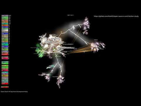
Finally there is visualization of the source code changes itself. I do this with a customized version of a tool called Gource . My modified version takes the same organizational mapping file Git Stat uses and groups contributors by organization. I use the same tag information to create captions as well so that it’s possible to watch the evolution of the source code over time. The major permutations I try to capture are looking at the entire project history where files in the visualization are only deleted if the developers deleted it and an “active files” view where only files touched in the last 60 days are shown in the visualization. I then run that with both the organizations view and the individual contributors view. Lastly for projects that have huge contributors I may run versions with the larger organizations isolated or specifically removed. For each project the input files and the commands used are all stored in the same repository as the results. This will allow anyone to recreate the results easily. An example of the visualization is below:
Future Work
With the above as a foundation I want to start studying specific projects that I find interesting and/or use to document their contribution diversity within the confines of what can be done with their Git History. These projects include, in no particular order:
- Elastic Search/Kibana (data already generated but haven’t done an analysis)
- OpenJDK
- OpenJFX
- Dotnet
- Kotlin
- V Lang
- Rust
- Linux Kernel
- Gnome
- GCC
- GLibC
Tools/Data Summary
- All results, configuration files, commands, data etc. are being archived at the Open Source Contribution Study Repository . With the data being released with a Creative Commons Attribution 4.0 license
- The raw statistics and graphs are generated by the Java program and Python driver programs in the Git Stat History Generator Project . The main README has full documentation of the tools and the tools have their own CLI documentation. The code is released under the Mozilla Public License 2.0 nd data in that project is also released under a Creative Commons Attribution 4.0 license.
- The custom Gource version is in this repository
in the
user-aliasesbranch. Building that will allow someone to reuse the organizational mapping capability as well.