


 2021-12-20
in
2021-12-20
in

 6 min read
Time flies especially as holidays are coming through, doesn’t it? A couple weeks ago I posted about the Kyanite Beta 2 release . It was about a month ago that I introduced the first beta of Kyanite . Today the third beta release. This is the one that I consider to be feature complete for a 1.0 release. Coming out of the second beta the two big features I wanted that were missing were link previews and the ability to look at posting statistics. There are some other features, tweaks, and bug fixes in this release as well. You can get the latest version for download here .
Link Preview
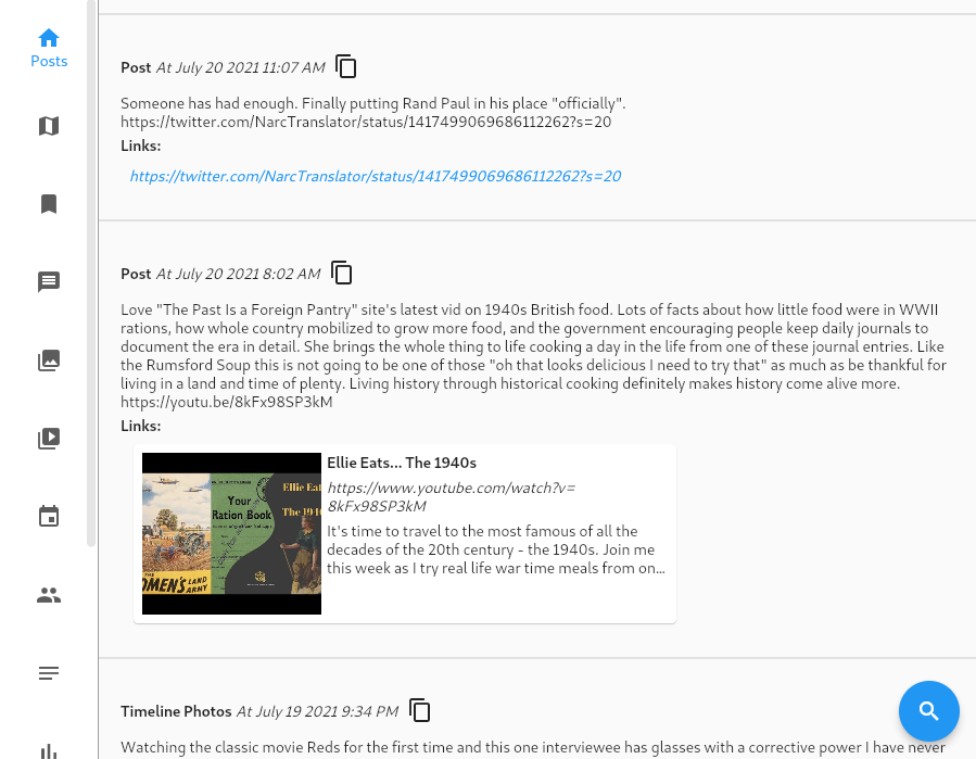
In the previous two releases links in posts were simply rendered as the URL of the link. This is obviously different than what we expect on modern user interfaces. What we expect nowadays is one of those little tiles with a preview image if it’s available, a headline, and maybe some body text. We then click on that which would bring us to the link. The magic of that most of the time is a standard called OpenGraph . This is some additional information that a website puts at the top of the HTML file that the link points to that gives hints to how an application could build a preview for its purposes. In this release Kyanite now reaches out to the server to generate that query and build that tile if it is available. If it isn’t available then it simply shows the URL like before. This will happen for links to other social media system posts like Twitter tweets because they actually don’t have a means for generating that data any longer. How do those tweets or Instagram links render in websites then? There is a whole JavaScript library that those sites link against to have it dynamically build that. Kyanite doesn’t have any of that so can’t use it. For links to regular websites though it works well. Below is a screenshot showing what the link preview looks like both when it can’t find it (the Twitter link) and when it can (the foodie link):
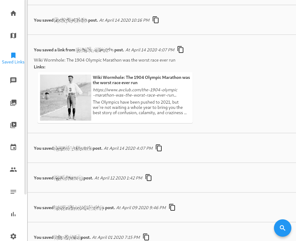
Saved Links/Items Screen
Facebook has a mechanism for saving posts or links that you like for future browsing. That data can be exported with your archive. It provides basic information about the link, when you saved it, and the hyperlink if it is to an external system. Most of the data is lost when the link is to another Facebook post or media item. So unfortunately for those things the best you’ll get back is something like “You saved John Smith’s post” and the time that you did. For external links though you’ll get more information and using the new link preview feature a standard preview if it is available too:
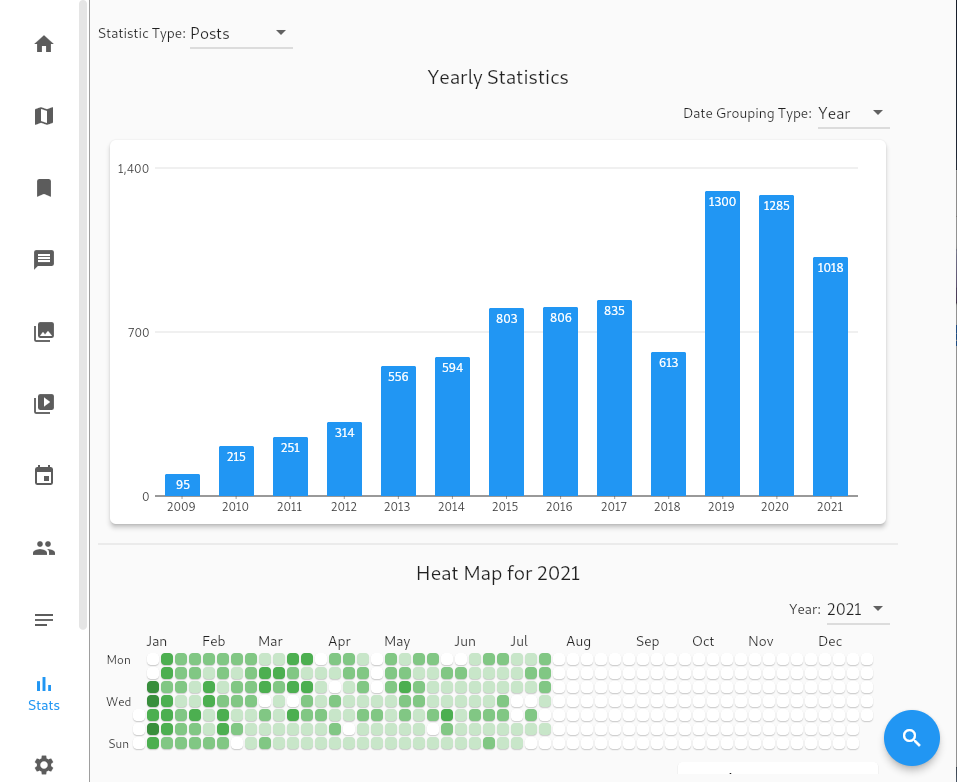
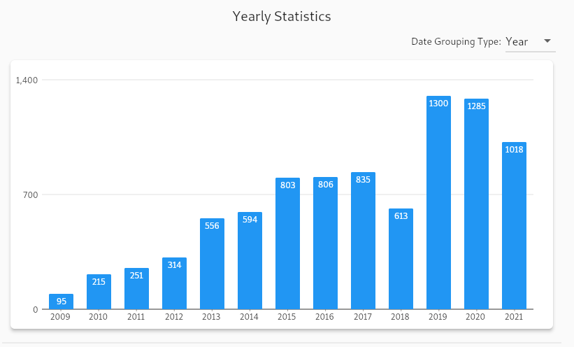
Stats Screen
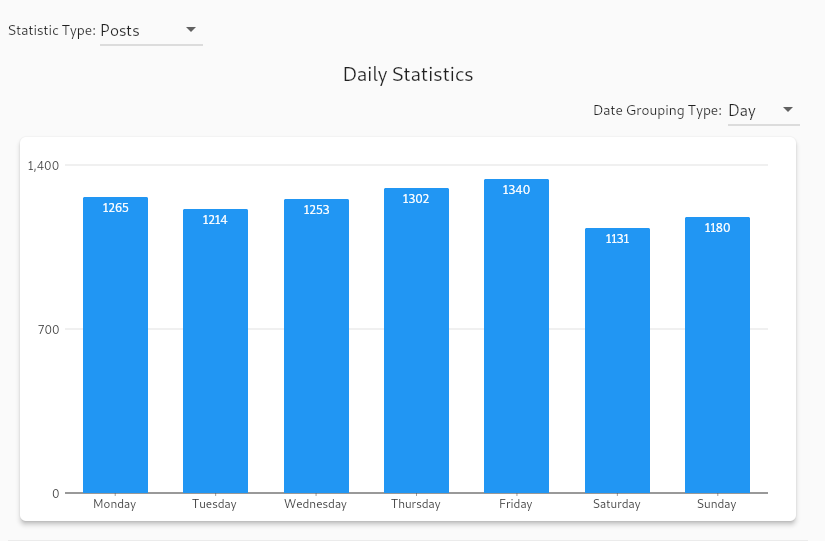
By far one of my favorite things is to quantify things in my life. It’s an engineer thing. I really wanted to do something like that with my Facebook data long before I got onto the whole “Delete Facebook” thing. The new Stats Screen will let you do just that. The stat screen has three components. The first component is a bar graph which displays the count of all of your posts by either the day of the week, the month of the year, or the year. This lets you see longer trends like how your posts per year have changed over time or if you more often posted on the weekends, for example. For example below is the graph of all of my Facebook posts per year and by day. As you can see I was pretty consistent with the days of the week I posted, but slightly less on the weekends. You can also see how exponential my posting frequency got every year, until I decided to try to start getting off Facebook in 2018. I still look forward to seeing my 2022 stats which will hopefully be nearly zero (just enough to post Kyanite and alternate social network posts).
The second component is a “heat map graph” which divides the year into 365 (366 in leap year) tiles laid out vertically by day of the week and horizontally by month. I don’t know if GitHub invented the concept but they certainly popularized it. It is a way to quickly see when you are most active over time. The color of each block is determined by how many of whatever item you are looking at statistics on you have. The darker the color the more active you are. If you hover over one of the tiles it will show the number of items on that date. I posted two of my heat maps below, one for 2019 and one for 2021:
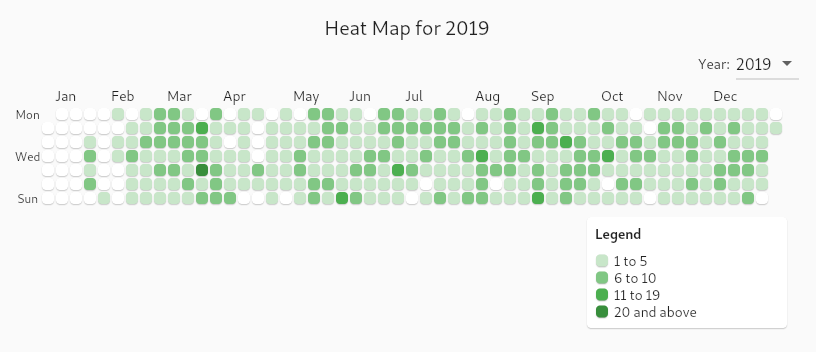
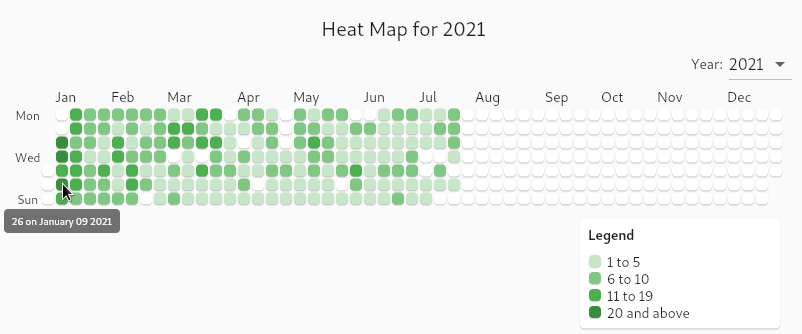
Heading into 2019 I was going to try to double down on getting off of Facebook, which I had some success on in bouts through 2018. You can see that by the unshaded early part of the the graph. However I quickly got back on and was often doing at least 1-5 posts per day. Compare that to 2021. In 2020 I again had some success with getting off of Facebook for larger stretches of time but the beginning of 2021 I got back on with a vengeance. In the beginning of January I have many days with more than 20 posts per day! On my busiest day I had 26 posts! That was across groups and my timeline but still that’s very verbose. Then it died down a bit until by July I was off it for good again.
The third component is a “top words” table. This filters out common useless words (like “a”, “the”, “I”, “you”, etc) and then tabulates over all of the text what the top words are. It defaults to the top ten but it’s possible for the user to select up to the top 100 posts. For example below are the top words in my posts for all of 2011:
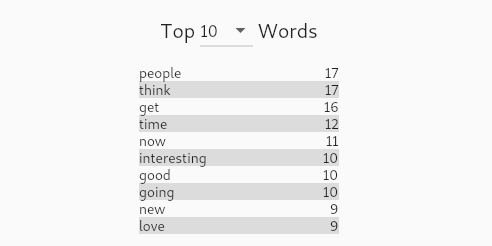
Notice I said those were my top words for 2011. By using the same filter controls that exist on the other screens you can use the stats tool for getting in-depth information about your data.
Bug Fixes
There were some bugs or less than ideal behaviors that were tweaked in this release as well. One problem, which was made a lot worse by trying to load link previews, was the drawing of every item in the timeline when a user dragged from the top to the bottom of the timeline. While there was some jumping going on it was causing a lot of work and janky behavior. I implemented something to defer loading when you blast by a row but it was still creating bad behavior. I also tried limiting how fast one could drag the scrollbar cursor but it just didn’t cut it down. So scrollbars are turned off now and scrolling is now done through flicking, dragging, or scroll wheels only.
On the filter panels the date start/time fields looked like they were editable directly. They were not. Editing needs to be done inside the date control itself. Changes made in the text field never made any changes. The field is now properly read only.
The navigation bar on the left was also starting to get too long as we add more screens. Rather than make the application minimum size ever larger that is now a scrollable view.
As always if you have bugs or feedback you’d like to make on the project, feel free to use the Issue Tracker or send an email to this email address .